
We know all about the cup-and-handle chart, and the hockey stick effect is a phenomenon familiar among accountants. But how can an elephant explain the Brexit?
The financial market experts are working hard to price in the effects of Brexit on stocks, bonds, and the macroeconomic world. Others are working on the reasons underlying the surprising outcome of last week's referendum.
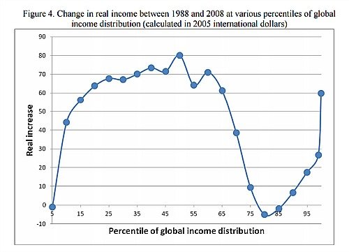
One of the early favorites among the experts is pretty cute: the elephant chart, presented first in 2012 by Branko Milanovic, an economist with the World Bank, who used it in an analysis of global income distribution.
Winners and Losers
The chart shows an elephant with his trunk pointing upwards (see picture above) and explains which incomes profited the most from globalization in the two decades through 2008 – and which lost out.
Moving production facilities to low-wage countries improved the pay in those areas, helped boost incomes of the already rich, but negatively impacted the middle classes in the Western world. It was there wages which got hurt the most (see chart below).
Financial experts now use this chart to explain how Brexit became a reality and with it all the effects that will follow the decision, «Bloomberg» reported.
From «Wall Street» to «High Street»
Merrill Lynch analysts concluded: «While globalization, immigration and the free market have strong support from the winners of these themes – the plutonomists and the highly-educated, in our view they seem to have underestimated the frustration of developed market middle and working classes."
They see Brexit as a sign of things to come, for a world which moves turns its back on globalization and scrambles to protect the national interest, from «Wall Street» to «High Street». The elephant might yet prove to be the one to crash the porcelain shop – after all, that's what he's known for doing in the first place.